

Page Revisions:
(July 31, 2022) Original
(November 20, 2022) New Trailer (#2)
(February 26, 2023) New Trailer (#2) — New Posters (#2-#13) — Synopsis Added
(March 19, 2023) New Posters (#14-#27)
Release Date:
March 24, 2023
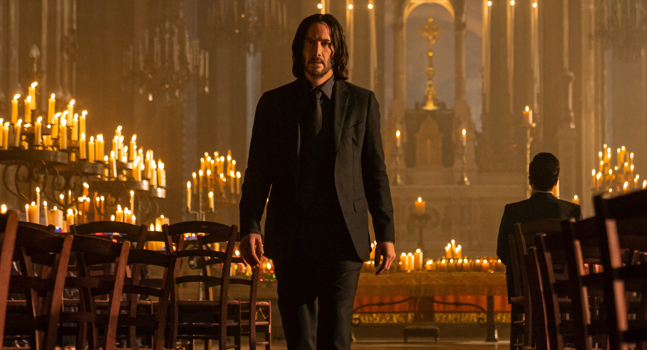
Synopsis:
From IMDb: “John Wick uncovers a path to defeating The High Table. But before he can earn his freedom, Wick must face off against a new enemy with powerful alliances across the globe and forces that turn old friends into foes.”
Poster Rating: C / C- / C+ (11) / C+ / C / C+ / C- / B- / C+ / B+ / C+ / C / C+ / C- / B- / C- / D+
SEE ALL POSTERS BELOW
Review: (#1) For some, this will be all they need to get excited about the film. For anyone else, it will be a rather uninspiring blend of reds, yellows, and blacks.
(#2) The hourglass effect in the tie is the only genuinely interesting element to this simplistic design. (#3-#13) These character posters are visually distinctive, which makes them appealing, but the background details are too staid.
(#14) Removing all of the décor around the Eiffel Tower seems like a poor decision as it makes it look odd. The attempt is to set a stark background for Wick, but it doesn’t work. (#15) The color scheme is overused and while there are some nice details, it’s ultimately not a very compelling design. (#16) Perhaps a bit more interesting, both in terms of subject and color scheme. It’s still not the most intriguing effort. (#17) A horrendous use of color, though the art is solid. (#18) A stylized take on a prior design with watercolor elements is the most visually splendid of the art pieces. (#19) While I admire the tenacity required to create this design, it’s rather lifeless. (#20) A lot of nice details, a refusal to bank only on the red-and-black to sell the piece. This is a rather gorgeous piece of art, certainly the best of all of the designs. (#21) This design feels forced and too chaotic in its color usage. The blend of details is fine, but ultimately doesn’t appeal. (#22) While it’s nice that they’ve chosen to lean into the color chaos, the subject is too minimal. (#23) This design is an attempt to appeal to foreign markets, but the film seems to be set in Paris, which ultimately makes it feel out of place. (#24) Wick with nunchaku doesn’t have a lot working for it and the excess of pink drowns and overwhelms. (#25) An interesting choice with a nice balance of details, though the color scheme doesn’t quite succeed. (#26) Unnecessarily simplistic even if well drawn. (#27) It’s such a waste of a design with lots of empty space and nothing visually striking.
Trailer Rating: C / C+ / C+
SEE ALL TRAILERS BELOW
Review: (#1) While it’s not as light as a normal teaser is, the lack of narrative information gives the action sequence very little punch and apart from fans of the series, it’s not the kind of trailer to excite anyone else.
(#2) Plenty of action and a bit of plot, fans of the series are going to be excited by what’s presented, but those who haven’t dived into the John Wick films aren’t likely to find anything here that excites them enough to go back to the beginning, which might partly depress turnout.
(#3) This action-heavy trailer throws in everything the fans of the series want to see, but does little to excited beyond that fanbase. It’s superficial plot details don’t make for a very appealing effort.
Oscar Prospects:
None.
Trailer #1
Trailer #2
Trailer #3
Posters


Poster #1Poster #2Poster #3


Poster #4Poster #5Poster #6


Poster #7Poster #8Poster #9


Poster #10Poster #11Poster #12


Poster #13Poster #14Poster #15


Poster #16Poster #17Poster #18


Poster #19Poster #20Poster #21


Poster #22Poster #23Poster #24


Poster #25Poster #26Poster #27


Leave a Reply