
Page Revisions:
(May 19, 2024) Original
(August 4, 2024) New Trailer (#2)
(September 22, 2024) New Trailer (#3) — New Posters (#3-#16)
(October 13, 2024) New Trailer (#4) — New Posters (#17-#23)
(November 17, 2024) New Posters (#24-#30) — New Release Date (changed from 11.27.2024)
Release Date:
November 22, 2024
Synopsis:
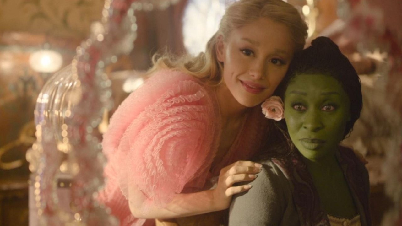
From IMDb: “After two decades as one of the most beloved and enduring musicals on the stage, Wicked makes its long-awaited journey to the big screen as a spectacular, generation-defining cinematic event this holiday season.”
Poster Rating: C / A / B- / B+ (2) / C+ (10) / C+ / C+ / B- / B / C / C / C- / C / C- (2) / B- (5)
SEE ALL POSTERS BELOW
Review: (#1, C) A very weak teaser design. The green background looks fitting and the sisterhood vibes work well but if you look at their pose, the shadow that’s cast isn’t even remotely accurate. A failure. (#2, A) On the other hand, you have this visually striking, thematically fitting, character-appropriate effort that blends brilliantly and captures the essence of the film entirely.
(#3, B-) A lot of designs that don’t fill the entire space still feel quite vacant. This design manages to avoid that by using the unique background framing design that draws the attention to the figures in the lower half while also accentuating the background. The tagline is even positioned to avoid leaving too much negative space. (#4-#5, B+) This character pair of posters is not far afield from the second design they released, juxtaposing to the two characters and their personalities with aplomb. That said, there is perhaps too much empty space in these and the background feels manipulated rather than real. (#6-#15, C+) These character posters use unique poses, colors, and settings to give everyone a feeling of uniqueness while remaining cohesive. While there’s perhaps not enough creative energy in the frame, these are fairly solid efforts. (#16, C+) Blending the pink and green while thematically fitting, makes the design chaotic and unfocused.
(#17, C+) The pink-and-green motif is a common contrast for these posters and this one seems a little more staid with static figures and some beautiful, if regimented background details. (#18, B-) With a similar aesthetic to an earlier design, all the details are confined to a smaller space without feeling sequestered. If only the background details were worthy of excitement as the foreground figures aren’t going to do all the heavy lifting. (#19, B) If the figures confined within the shape of Emerald City took up more of the design, this would be a more impressive feat. Unfortunately, they are relatively small and the background is shockingly empty. (#20, C) Dolby usually has the best designs but this disappoints on many levels. It takes a scene from the film and highlights it with an emerald glow but there’s nothing to the background that genuinely makes it interesting. Even the Double-D logo is bland. (#21, C) The tilt of the design suggests action as do the running poses of the central figures but it doesn’t have enough to the background. However, for an IMAX design this is one of their best efforts. (#22, C-) A pointless poster design to announce ticket sales with overly-PhotoShopped arms holding hands. That with the empty black background simply don’t stand out in the way the designers likely wanted. (#23, C) Taking inspiration from the original Broadway poster design, it seems to lack the characteristic smirk of Elphaba featured on that design that made it so interesting. The background is equally uninspired.
(#24-#25, C-) This pair of images are lacking in depth and lack the kind of richness of design style that stands out to audiences. (#26-#30- B-) These character posters might not have the kind of rich details one would hope for with such efforts but the backgrounds are fitting to each character, the array of colors is visually exciting and they all ultimately feel like things one would want to hang on a wall.
Trailer Rating: A / C+ / B+ / B+
SEE ALL TRAILERS BELOW
Review: (#1, A) So many musical films avoid their musical content like the plague and it’s always been puzzling. This exemplifies why you should use it. There’s no doubt this is a musical and fans of the stage version are certainly likely to take note. Anyone familiar with it is also able to pick up key moments that stand out. It likewise builds in intensity to a conclusion that feels utterly fitting. Drawing out emotion for fans of the show is the perfect way to make the production a hit.
(#2, C+) It’s amazing how a truncated “teaser” can feel less exciting or intriguing as a full trailer. It seems the creator didn’t understand the assignment, especially not of selling a musical.
(#3, B+) The music cues in the trailer are limited and suggest a lot of perhaps unwelcome changes to the material, at least for Wicked purists. The imagery, however, should very much please them making this a bit of a mixed bag. It also gives away some of the more dramatic moments. That won’t faze many fans but might make everyone else wonder why they should watch it.
(#4, B+) It’s a musical and these trailers are leaning into that and that’s a wonderful thing. The mix of various songs is well handled and with tons of setting details, character costumes, and other elements that make the show pop, this is an effective effort.
Oscar Prospects:
Visually stunning, this film will most certainly be a frontrunner for several craft categories. Strong reviews will be necessary to contend outside of the craft areas.











Leave a Reply