
Page Revisions:
(December 18, 2022) Original
(April 9, 2023) New Trailer (#2) — New Poster (#1)
(May 28, 2023) New Posters (#2-#33)
Release Date:
June 2, 2023
Synopsis:
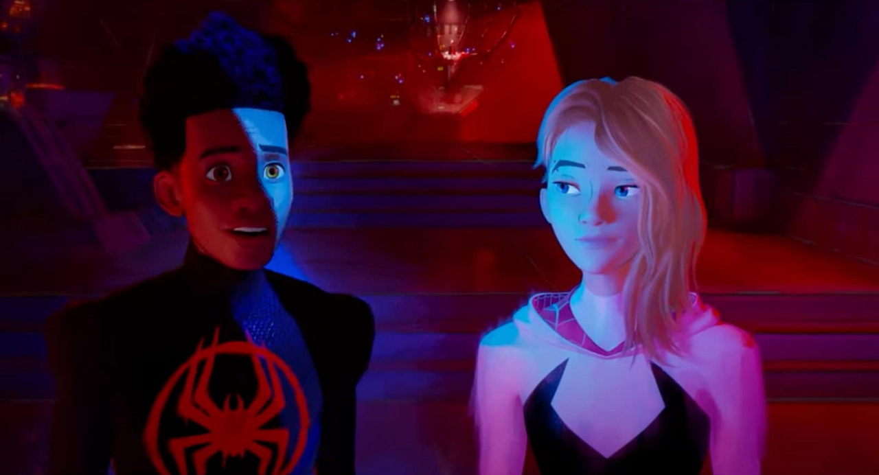
From IMDb: “Miles Morales returns for the next chapter of the Oscar®-winning Spider-Verse saga, an epic adventure that will transport Brooklyn’s full-time, friendly neighborhood Spider-Man across the Multiverse to join forces with Gwen Stacy and a new team of Spider-People to face off with a villain more powerful than anything they have ever encountered.”
Poster Rating: B- / C+ / C / C / C+ / B- (4) / C+ / C / C+ / C+ (7) / B- (5) / C+ (9)
SEE ALL POSTERS BELOW
Review: (#1) All the Spider-Men in one design will have a certain appeal to fans of the character, but the overall strength of the design is limited.
(#2) Plenty of detail and lots of different Spider-people, but it also feels cluttered. (#3) The eye reflections feel overused between two pair and the background characters seem needlessly infused. (#4) An interesting take on including background characters, but the vacant space on the left and bottom only adds tedium. (#5) This one isn’t as chaotic as the prior designs, but still suffers from the lack of compelling background details. (#6-#9) These format/sound designs are far more compelling than a lot of their contemporaries with IMAX once again the weakest. I’m beginning to wonder if IMAX’s guidelines for use of its logos are presenting obstacles to genuinely compelling creations? (#10) Going back to an earlier motif with the orange-yellow hexagonal shapes and the excess of Spider-characters. This effort isn’t better or worse. (#11) If it can be left empty, it shouldn’t be and this design doesn’t learn from past mistakes. Not much new to see here. (#12) These colors are more sedated than previously, which makes some of the design details pop more even if the tiny background characters are utterly indistinct. (#13-#19) This set of character posters are unique and compelling. They have visual flair and that sets them apart in a flooded marketplace. (#20-#24) This small grouping of character designs are a little richer than the prior set. (#25-#33) This last batch of character posters build off prior efforts, but still feel inferior to most everything that came before.
Trailer Rating: C+ / B
SEE ALL TRAILERS BELOW
Review: (#1) There’s a lot to pay attention to in this trailer and the simple narration from a scene in the film doesn’t have the right impact as our minds are utterly diverted by the chaotic visuals underneath. For fans of the first film, this doesn’t quite have the feeling of that film’s presence and that could be an issue.
(#2) Getting a lot more details about the premise of the film is important to engaging viewers, but there’s a certain degree of chaos on display that is ultimately confusing, though that won’t dissuade fans of the first film.
Oscar Prospects:
The original won Best Animated Feature, but can this one follow that up? It’s hard to tell since the Academy isn’t a fan of sequels, but if it’s good enough, it might.
Trailer #1












Leave a Reply