
Page Revisions:
(September 1, 2024) Original
(December 1, 2024) New Trailer (#2) — New Posters (#2-#30)
(December 15, 2024) New Posters (#31-#32)
Release Date:
December 20, 2024
Synopsis:
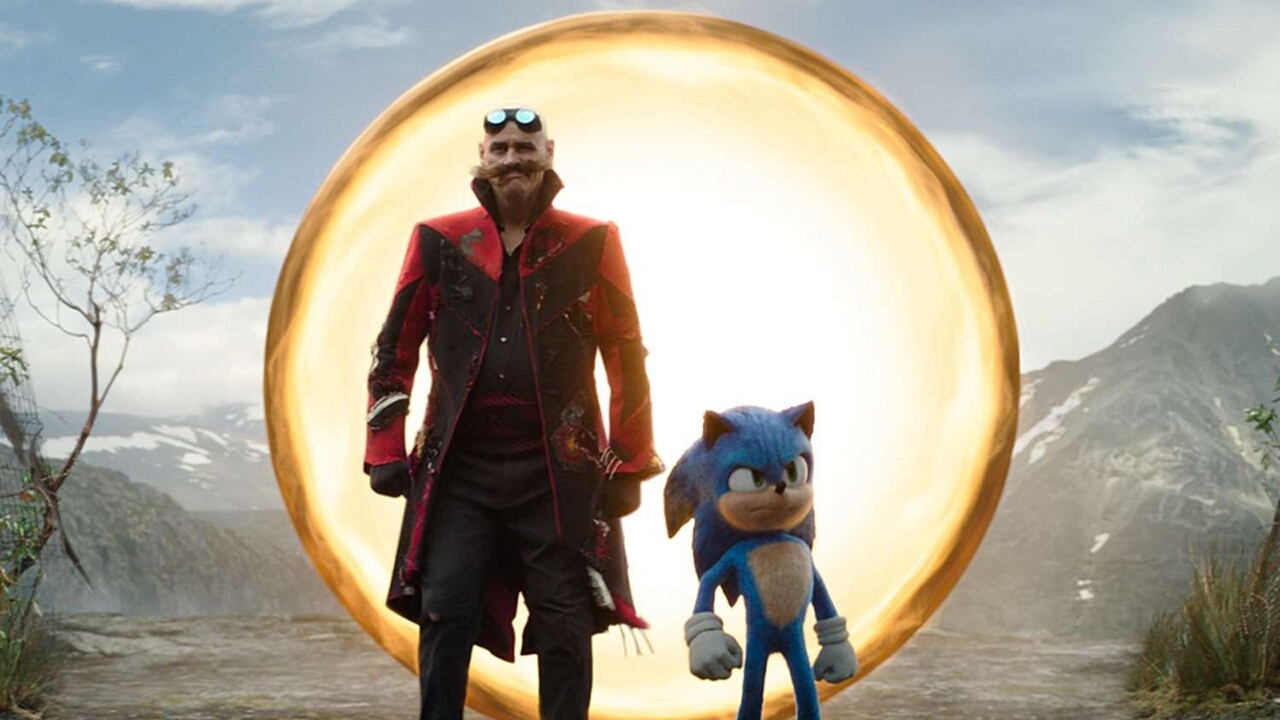
From IMDb: “Sonic reunites with Knuckles and Tails against a powerful new adversary, Shadow.”
Poster Rating: B- / C+ / C / C+ / C+ / C+ / C (12) / C (5) / C / C / B- / C / C / C / C (2) / B-
SEE ALL POSTERS BELOW
Review: (#1, B-) With some obvious effort, the two figures create a stream of energy that looks like a three. Using the color scheme of prior designs in the series will be striking but this feels a bit more teaser than necessary.
(#2, C+) The titled nature of the design does match the motion of the motorcycle but the hand digging into the pavement makes little sense for a character without claws. (#3, C) Dull and lifeless, this design doesn’t tell the viewer much at all except that the main characters (hero and villain) are covered. (#4, C+) It’s nice to have all the characters in one design but they are poorly arrayed on the design, which makes it a surprisingly bland effort. (#5, C+) Similar to the prior design, this feels a little more action-focused but probably not sufficiently so. (#6, C+) A closer-up version of the prior design, which might de-accentuate the background but it makes the lack of details more readily apparent. (#7-#18) These character posters are relatively cheap to produce, especially when all you have to do is alter the color of the static background image and put people on top of it. Not impressed. (#19-#23,) Another series of dull character posters. They at least have more action and background detail but aren’t much improved in terms of cheapness. (#24, C) This looks like it could be a part of the prior design series but the composition doesn’t seem to fit in with that, so they aren’t terribly exciting. (#25, C) Maybe the kanji say something of value but I suspect not and besides, it’s the composition of the design that matters and that is horrendous and dull. (#26, B-) Of the format-specific designs, this is the most dynamic and visually compelling. It’s still relatively simplistic but at least it tries for something smashing. (#27-#28, C) These other format designs are unique but limited in detail and that’s just not as interesting as it should be. (#29, C) Without all of the characters, this design seems uncrowded and that only allows the background details to flop out in front of the audience without doing something captivating. (#30, C) This format design is on par with the prior two that lacked anything genuinely exciting.
(#31, C) This is the same concept as #30 and doesn’t merit additional attention. (#32, B-) An interesting departure from the other designs with a subtle 80s/90s vibe that is fitting for the character. It’s perhaps a bit too overbearing in its color chaos but an overall improvement in design.
Trailer Rating: C+ / C+
SEE ALL TRAILERS BELOW
Review: (#1, C+) Perhaps the release date were too fast approaching because the first trailer seems like a full one. It sets the stakes, introduces the characters, and somewhat sets up the thrust of the film. Fans of the series will no doubt be intrigued.
(#2, C+) The first trailer made it seem like Dr. Robotnik was going to be an ally but this trailer puts him squarely on the enemy’s side. That kind of 180-degree turn only exacerbates the feeling of familiarity and lack of inventive originality. Pure fans won’t care and non-fans won’t either.
Oscar Prospects:
None.










Leave a Reply