

Page Revisions:
(December 22, 2024) Original
(March 9, 2025) New Posters (#2-#10)
(March 16, 2025) New Trailer (#2)
Release Date:
March 14, 2025
Synopsis:
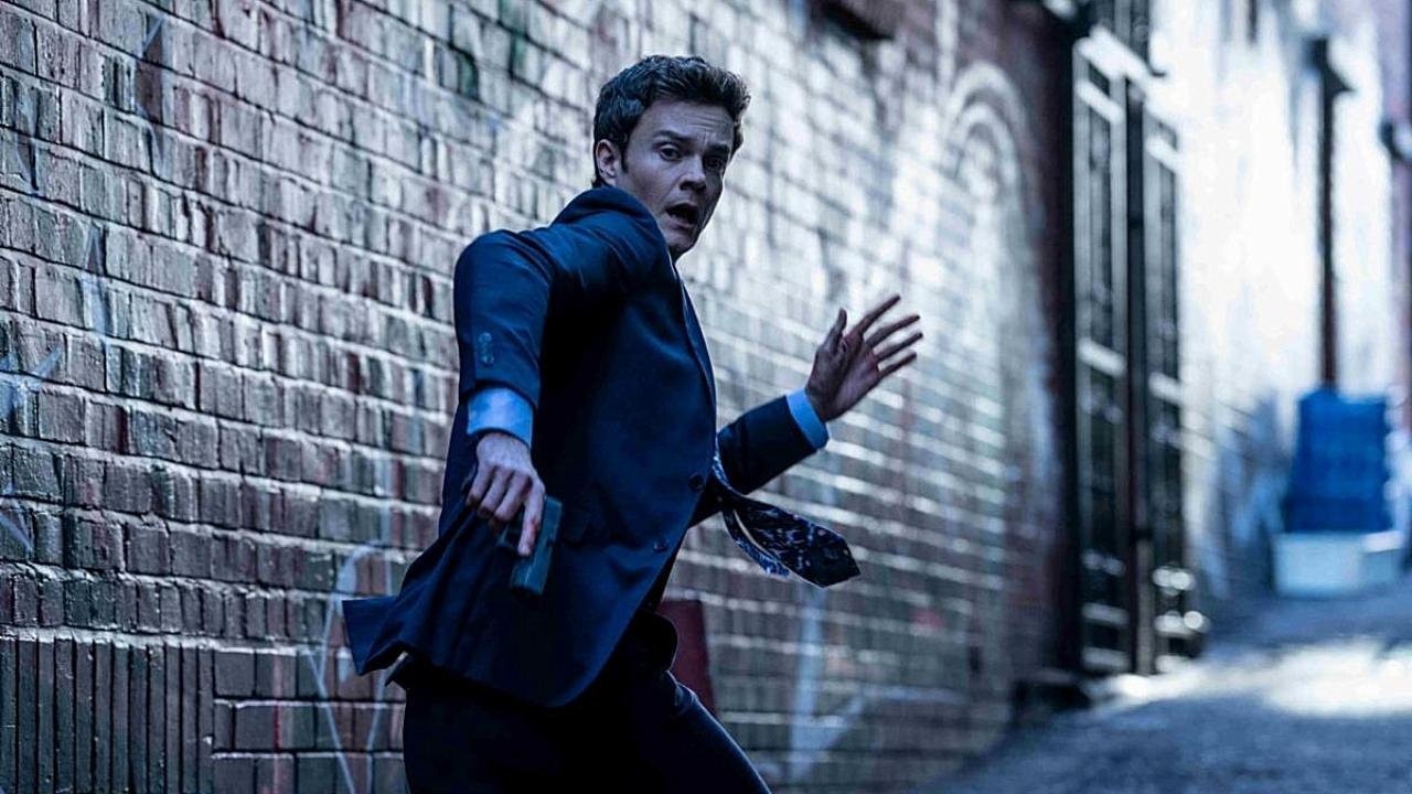
From IMDb: “When the girl of his dreams is kidnapped, a man incapable of feeling physical pain turns his rare condition into an unexpected advantage in the fight to rescue her.”
Poster Rating: C+ / C / C (2) / C / B- / C+ / C / B- / C+
SEE ALL POSTERS BELOW
Review: (#1, C+) If you know the game of Operation well, this will remind you easily of it. However, the overwhelming yellow background clashes with the choice of red border and title. It’s like they took the standard action color scheme (black-yellow-red) and tried for something inventive without creating something more than adequate.
(#2, C) A commonplace black-white-and-red action-horror design that thankfully adds some yellow elements but doesn’t create anything enticing or compelling. (#3-#4, C) While each is unique, they take the same concept and use it poorly. There’s a certain lack of realism that makes these efforts feel misplaced. (#5, C) If you take the interesting Operation design of the first poster and overburden it with text, you’d have this abomination that’s gaudily bright and overwhelming. (#6, B-) Building up with a column of details makes for a pleasing poster design. The use of colors, while unique, is a bit overbearing. (#7, C+) A Hitchcockian design that misuses shadow techniques and employs an uninspired color scheme. (#8, C) We’re back tot he smooshed face concept that was used in designs 3 and 4 while diminishing the weapon elements. (#9, B-) It may be simplistic with a lot of empty white-space but it uses the pain scale most efficiently thought it might have had more impact if each of the faces grew progressively more damaged. (#10, C+) Taking the bullet aesthetic of design 2 and turning it into something more two-dimensional is an interesting choice. The colors aren’t perfectly chosen but it evokes a sense of concept.
Trailer Rating: C+ / C
SEE ALL TRAILERS BELOW
Review: (#1, C+) There’s an intriguing concept at the heart of this film and the trailer does execute it well but the action around it is very tired and familiar and that might not be enough to sustain audience interest.
(#2, C) It doesn’t do well at explaining the principle concept of the film and a few of the elements of physics that don’t make sense stand out as a result. Still, it has enough charm and tongue-in-cheek humor to at least have some measure of appeal to viewers. It just needed to be more unique and more informative than the prior trailer.
Oscar Prospects:
None.
Trailer #1
Trailer #2
Posters


Poster #1Poster #2Poster #3


Poster #4Poster #5Poster #6


Poster #7Poster #8Poster #9

Poster #10


Leave a Reply