
Page Revisions:
(July 31, 2022) Original
(January 29, 2023) New Trailer (#2) — New Posters (#2-#3)
(March 12, 2023) New Trailer (#3) — New Posters (#4-#19)
(March 26, 2023) New Posters (#20-#22)
(April 2, 2023) New Trailer (#4)
Release Date:
March 3, 2023
Synopsis:
From IMDb: “Not Available”
Poster Rating: C / B- / B- / C (6) / C / C / C+ / C+ (7) / C / B / C+
SEE ALL POSTERS BELOW
Review: (#1) The giant ampersand is a familiar emblem for the D&D world, but the silhouettes being so small and the yellow energy burst being too large, makes it all feel rather bland.
(#2) There are a lot of details, but it feels a touch too limited in its color scheme, which makes it feel like it blends together too easily. (#3) This is a bit better from a blending perspective, but the faces are all touched up a bit too much to look authentic, which makes the effort feel forced.
(#4-#9) This series of character posters lacks background details and are almost too uniform to be unique. (#10) The party must succumb to the iconography in the worst possible way. (#11) A cute owlbear on the poster that feels a bit too meager on the color selection. (#12) It creates action, but also feels cheaply-made with the dungeon and the dragon, but no sense of energy. (#13-#19) A better set of character posters, but the backgrounds still feel a bit dull even if uniquely colored and adorned.
(#20) The displacer beast almost seems like a character design, but also doesn’t feel very fresh or unique. (#21) This is a nice design that tries something entirely new and generally works. There’s a lot of empty space, but that’s overcome with the simplistic beauty of the cavern and the silhouettes. (#22) Using the D&D ampersand as the framing device is a solid choice, but the empty backdrop doesn’t enhance it, instead making it feel empty.
Trailer Rating: B- / C / C+ / C
SEE ALL TRAILERS BELOW
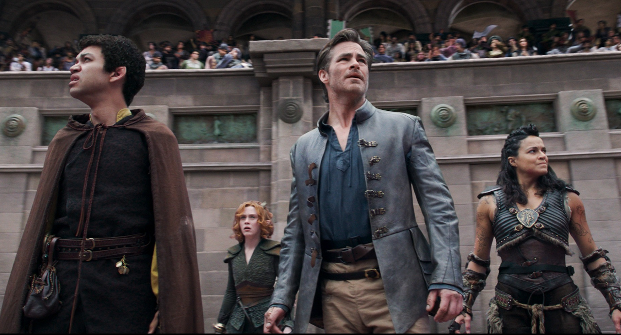
Review: (#1) Dungeons & Dragons players of all stripes will likely find something here to get excited about. Mimics, owlbears, acid-spitting black dragons, and a simple introduction to some of the classes on display will certainly make the film appealing. However, those who aren’t already fans aren’t likely to be excited about this particular effort.
(#2) All the good will left over from the first trailer evaporates in the second. The humor’s cheesier and less funny. The action is overbearing and lightly cinematic. The game elements are hard to catch and lacking in intriguing. It all adds up to a trailer designed for people who aren’t picky or choosey about these things.
(#3) It’s astounding that a film about a table top game that’s supposed to be built around the players’ use of imagination is somehow cheaply drawn, dully humored, and feels too action-oriented for its own good.
(#4) A chaotic trailer that tries to turn approving critic reactions into reasons to see the film, but it’s too little too late and no one who hadn’t already decided to see the film will suddenly decide they want to after seeing this trailer.
Oscar Prospects:
None.
Trailer #1















Leave a Reply