
Page Revisions:
(March 10, 2024) Original
(June 16, 2024) New Trailer (#2) — New Poster (#2)
(September 15, 2024) New Trailer (#3) — New Posters (#3-#13) — New Release Date (changed from 9.27.2024)
(September 22, 2024) New Poster (#14)
Release Date:
September 20, 2024
Synopsis:
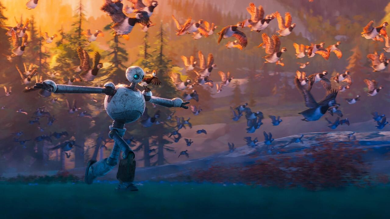
From IMDb: “After a shipwreck, an intelligent robot called Roz is stranded on an uninhabited island. To survive the harsh environment, Roz bonds with the island’s animals and cares for an orphaned baby goose.”
Poster Rating: C / C / C+ / C / C+ / C / C+ / C- / C / C (2) / C / C / C+
SEE ALL POSTERS BELOW
Review: (#1, C) The reflection in the eyes is too minimal to be understood easily and the robot figure doesn’t strike the viewer as someone they would be enthralled about seeing.
(#2, C) When making a poster design for a computer animated project, it’s always a little mystifying why they would use a design that looks painted. The tacked on DreamWorks logo and the non-painted titling stand out too much.
(#3, C+) Affectionate in a way but a bit dull. (#4, C) There isn’t enough to this to create excitement. It appears just to be a scene from the film. (#5, C+) An action design that tells the audience something about the film. It might have some minor impact on viewer interest but not likely enough. (#6, C) Trying to capture the beauty of the trailer isn’t terribly successful here. (#7, C+) It has a nice feel to it, celebrating the beauty of the wilderness and the storyline but its two-dimensional background makes the three-dimensional robot look out of place. (#8, C) Another flat design with a three-dimensional quality that feels exceedingly out of place in a modern context. (#9, C) The excitement of the action design earlier is visually toned down here with the yellowness of the prior being excised, which makes it difficult to see this as anything but dull. (#10-#11, C) Another of the 2D backgrounds poorly blended with the 3D figures. This time, they appear to be character posters and that just won’t do. (#12, C) A slightly more intimate version of an earlier design. There’s a lot of blurriness in this design and while that might draw attention to the central figures, it does so in an undesirable way. (#13, C) This design creates some tension but it might be too alien abduction-adjacent for its own good.
(#14, C+) There isn’t enough new to this design to make it stand out. The coloration is a bland and unappealing.
Trailer Rating: A- / B / B-
SEE ALL TRAILERS BELOW
Review: (#1, A-) A gorgeous film that doesn’t tell the audience much about the plot but gives them a general sense of wonder. This design should be quite successful in appealing to viewers.
(#2, B) The first trailer had a majestic, beautiful quality to it while this one focuses in more on the story. It presents perhaps too much of the narrative, suggesting exactly what direction the whole film will go but there’s still enough gentleness and breathtaking beauty to build interest in the film.
(#3, B-) Taking the content of the prior trailers and making the whole thing feel less consequential is not the direction you want subsequent trailers to go. This ends up making the film look fairly rote and does nothing to generate continued excitement.
Oscar Prospects:
A strong contender for Best Animated Feature. Originals from major studios are always competitors.
















Leave a Reply
You must be logged in to post a comment.